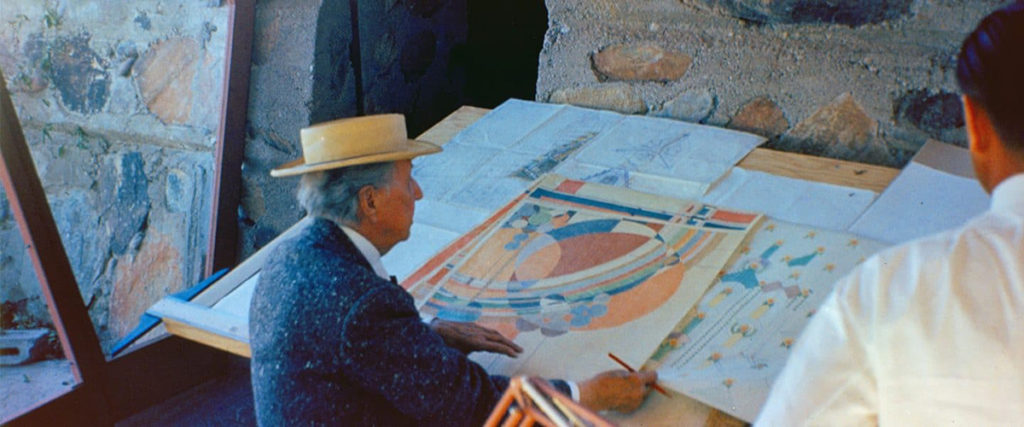
I’ve always painted, but certainly nothing that required my initials in the lower right-hand corner. My endeavors were limited to walls, floors, and ceilings, with an occasional dalliance focused on exteriors. And there was this walk-in refrigerator the size of a NYC subway car … but that’s a story for another day.
Painting was not a process I initially considered artistic or creative. That is, until a new book found its way into my library, Donald Kaufman’s colors, and Suzanne K Butterfield’s theory, make Color Palettes an indispensable resource.
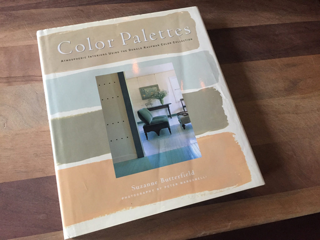
The who of Kaufman is impressive: he is the “go to guy” for the Metropolitan Museum of Art when they need a new single shade for a wing of the museum. I found something recognizable in this book, echoing my beliefs on cooking.
This was a metric that instantly made sense to me, the colors of food!
Connections Between Painting and Cooking
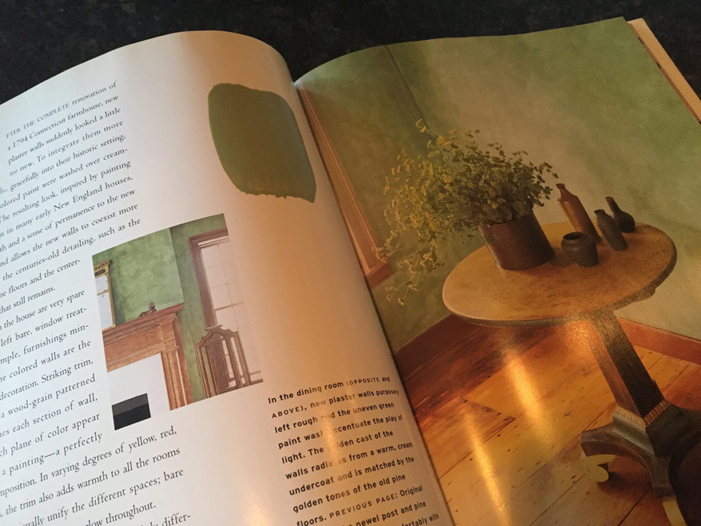
Listen to Kaufman’s and my words and notice the resemblance:
- “Use as few colors as possible, try to calm it down” – DK
- “When you cook, take care not to overdo it, let the simplicity of the ingredients shine” – GEM
- “The cost is in the labor, go for the gold in the materials” – DK
- “Buy ‘really seriously good food’ – it might seem obvious but ‘ingredients matter” – GEM
Lessons from Frank Lloyd Wright
The very first architect to capture my attention was FLW. The year was 1971 and I was a freshman selecting my course schedule. It seemed natural to learn about design and drafting.
So many of the projects around our home began with my dad at the drafting table and my mom assembling a folder of design elements. As I learned the basics of drawing with a T-square and a triangle, I researched Wright – the Master of Design. It was everything about Wright that attracted me to his world-class style.
“The relationship of inhabitants to the outside became more intimate; landscape and building became one, more harmonious; and instead of a separate thing set up independently of landscape and site, the building with landscape and site became inevitably one.” – FLW
Wright took furniture, fabrics, artistic glass, and lighting into account. The colors in each of these elements made a difference. They work in harmony to build a place where people live; it was referred to as “The Great Mother Art.”
Wright believed that people, objects, and actions define civilization as a work of art. I was fascinated with the relationship color had to just about everything involved in every art.
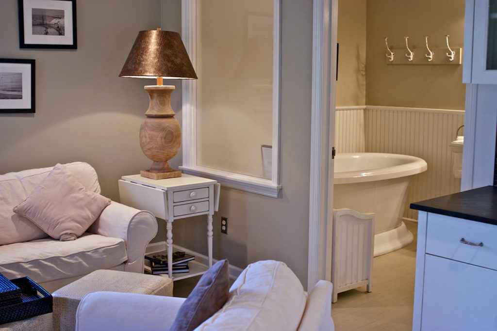
The interior design lessons professed by FLW were taken to heart when we began to decorate MHI with color. We developed a way to choose colors that allowed us to clearly see the effect it would have on design … and eventually on our guests at the Mill House.
We learned to build harmony within every area of the property. Again, I noticed a similarity between food and color and their relationship to overall design:
- First Course: Varied research eventually yields a solid direction
- Second Course: Focusing on the established direction results in a theme
- Third Course: With direction and theme in place, add a bit of obsession and “it’s time to cook”
Choosing the Colors of the Mill House Inn
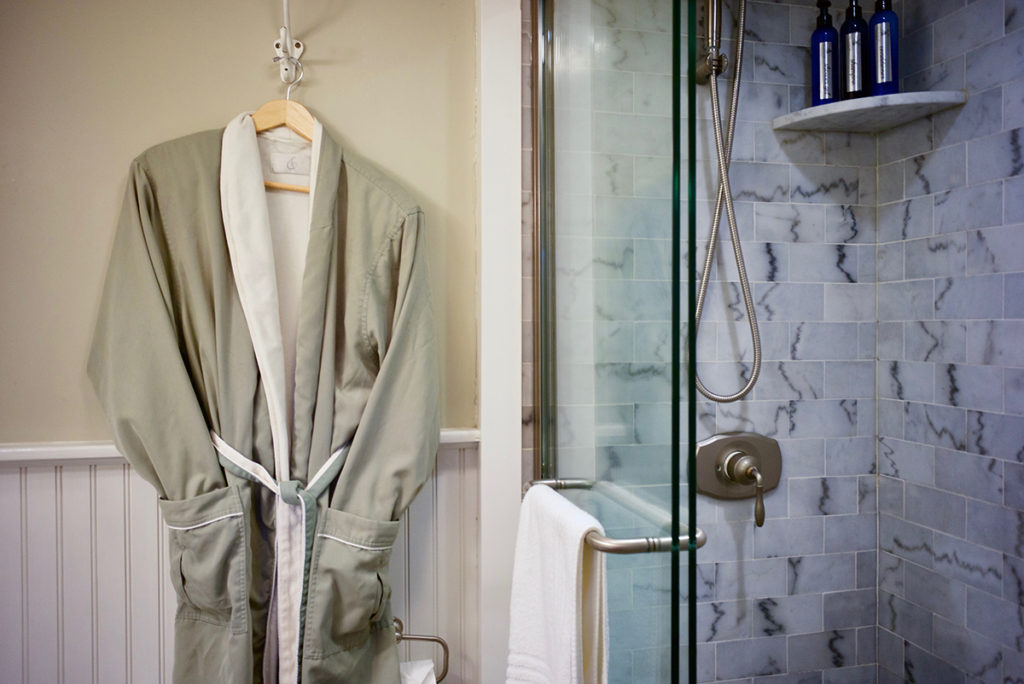
First we establish a direction — giving consideration to the entire project — in advance. Then, we follow our guidelines:
- Geography and history make a difference in color choices
- All the rooms in the house are part of one project
- Exteriors, landscapes, and hardscapes deserve consideration
- Use colors that reflect adjacent colors
- Picture yourself walking room to room, what do/will you see?
- Always leave room for a bit more color, finishing touches will happen
- Colors are Emotional, how will they make you feel, what story will they tell?
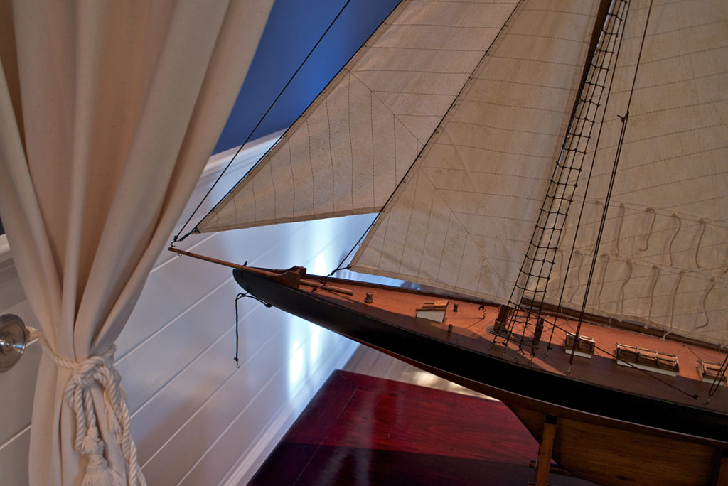
Additional parts of the color theme to be considered:
- Furniture: wood color, upholstery
- Fabric: curtains, rugs
- Lighting Style
Robert & Susan Downey’s Windmill Cottage

Purchased by the Downeys in 2017, the Edward DeRose Windmill Cottage in East Hampton is a beautiful study in Hamptons design and simplicity of color.
When Architectural Digest visited with the Downeys, Robert spoke about past encounters with designers — “Our previous experience with designers was sucky.”
Then he recounts working with Fox-Nahem: “Mrs. Downey and I have enjoyed a remarkable collaboration with the entire Fox-Nahem team. We’ve been pushed out of our ‘comfort zone’ without losing our personal sense of style, taste, or dignity.” In other words, “not sucky at all.”
Do watch the video of the Downey’s new home, Hamptons design done very-very well!
Bye for now, have a beautiful week. Next week I’ll continue the story … “The Color of a Home, Part Two.”
Color is such an important part of the Millhouse Inn and the Hamptons experience. Call us or email us to come out and experience it for yourself!
– Gary


